A collection of my design work from recent projects—showcasing interfaces, layouts, and visual solutions. Each piece reflects my approach to clean, functional design.
Explore My Projects
SEVEN Makeup Design
Overview
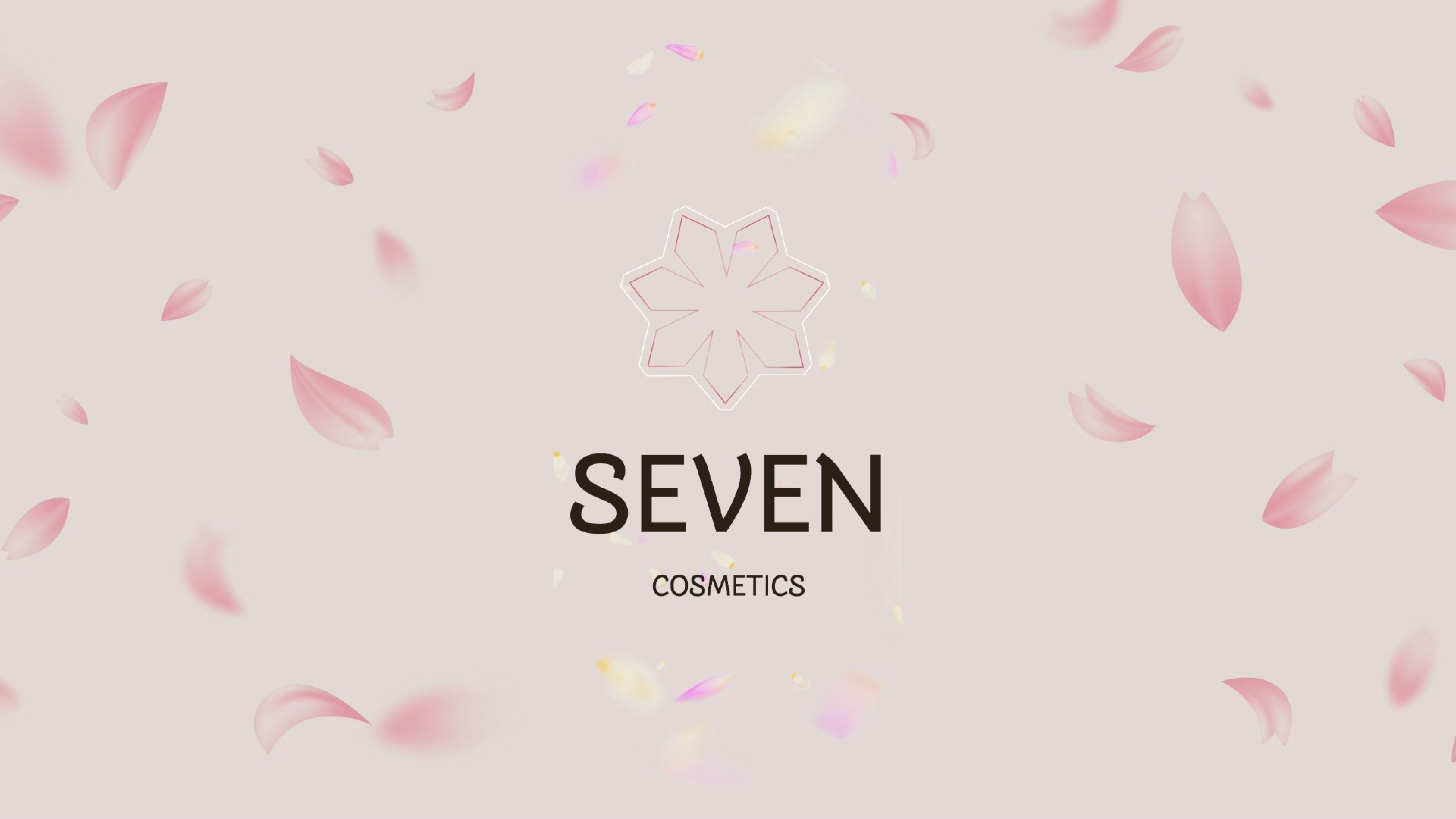
SEVEN is a cosmetic brand for modern women. The name and the seven-petal flower logo come from the idea of "seven" — a symbol of balance and completeness. Each petal stands for one quality: confidence, elegance, authenticity, strength, grace, balance, and personal expression.
I designed the full brand identity: logo, colors, typography, and guidelines.
My Role
Brand Designer
Completed
2025
Building the Brand Identity
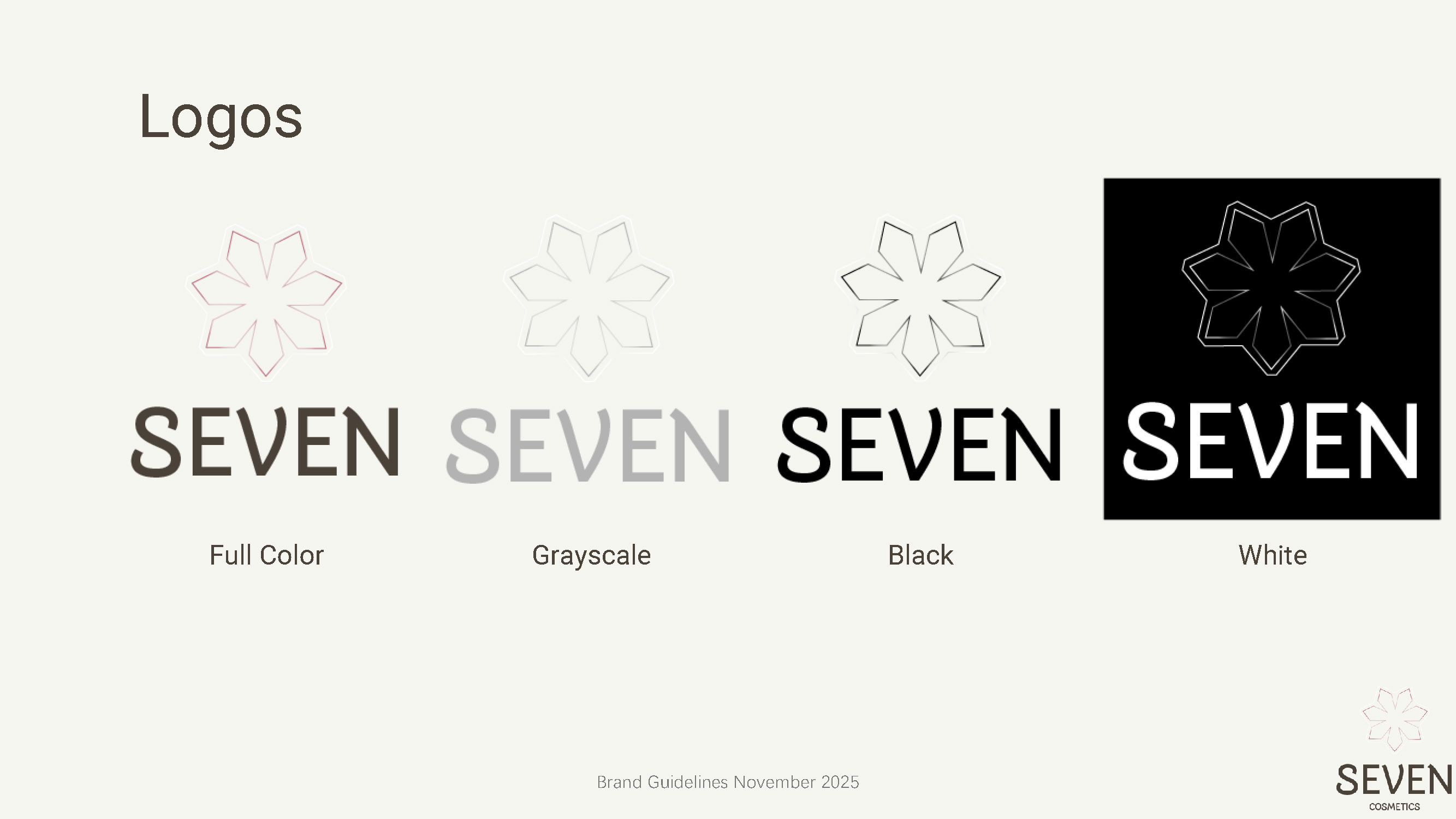
I started with the core idea: "seven" as a symbol of wholeness. The seven-petal flower became the main logo. I made sure it works in different formats: full color, grayscale, black, and white.
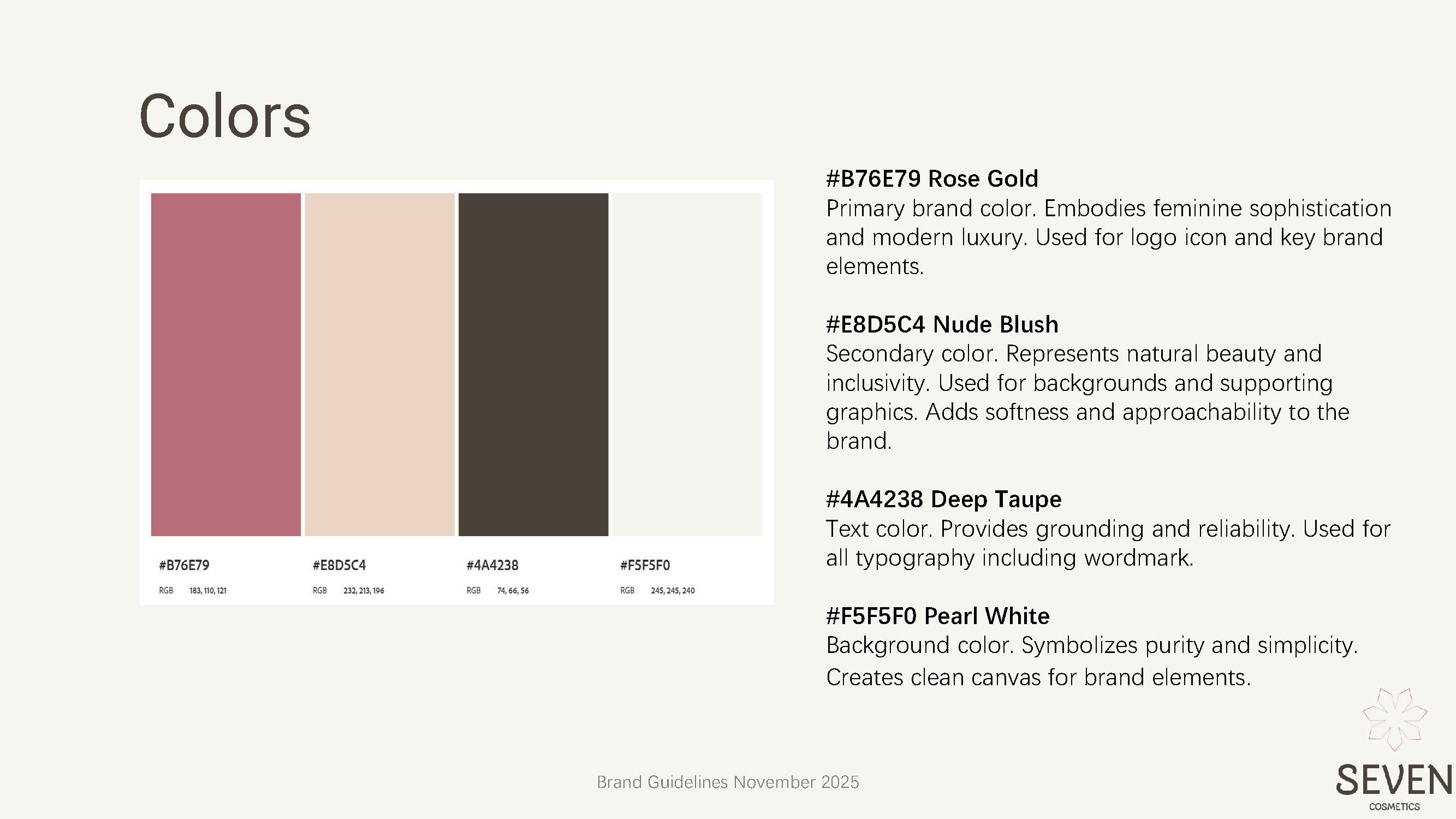
Choosing Colors & Typography
The color palette is simple and meaningful.
For fonts, I chose Roboto because it's clean, easy to read, and feels warm — perfect for a brand that wants to feel both professional and friendly.
Logos
Designing for Different Screens
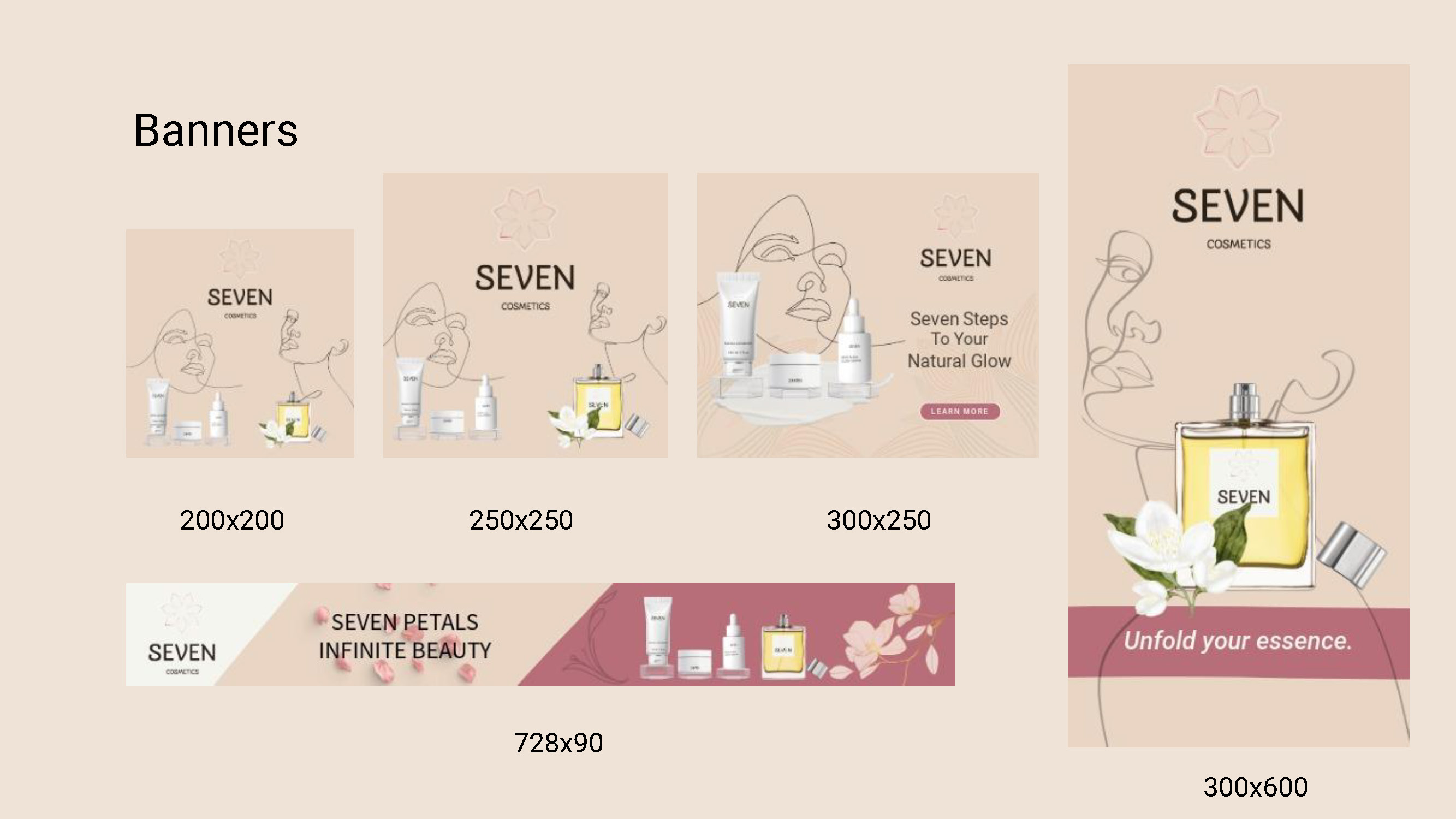
I created banners in five different sizes to show how the brand looks on different websites or apps. The designs are consistent: same logo, same colors, same layout style. Even though the sizes change, the brand always looks like SEVEN.
Quatro
Overview
Quatro was a beloved UK fruit-flavoured fizzy drink (1982-1989). After a long hiatus, it's making a comeback — now in a low-sugar formula, staying true to its iconic four flavours: Pineapple, Orange, Grape, and Passion Fruit, with more to follow.
This project provides a complete design system for the relaunch of Quatro—ensuring every application presents a clear Quatro style.
My Role
Brand Designer
Completed
2025
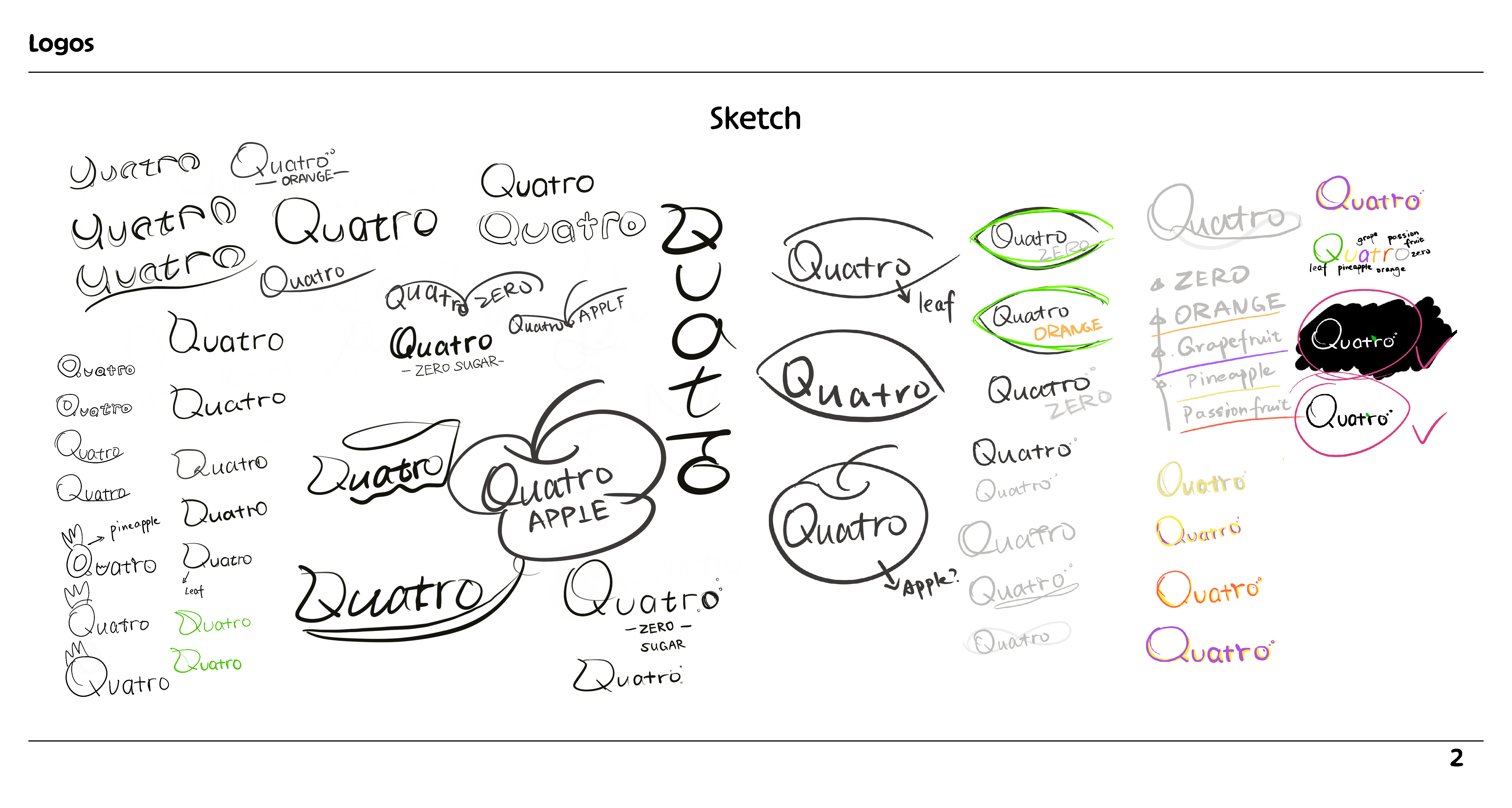
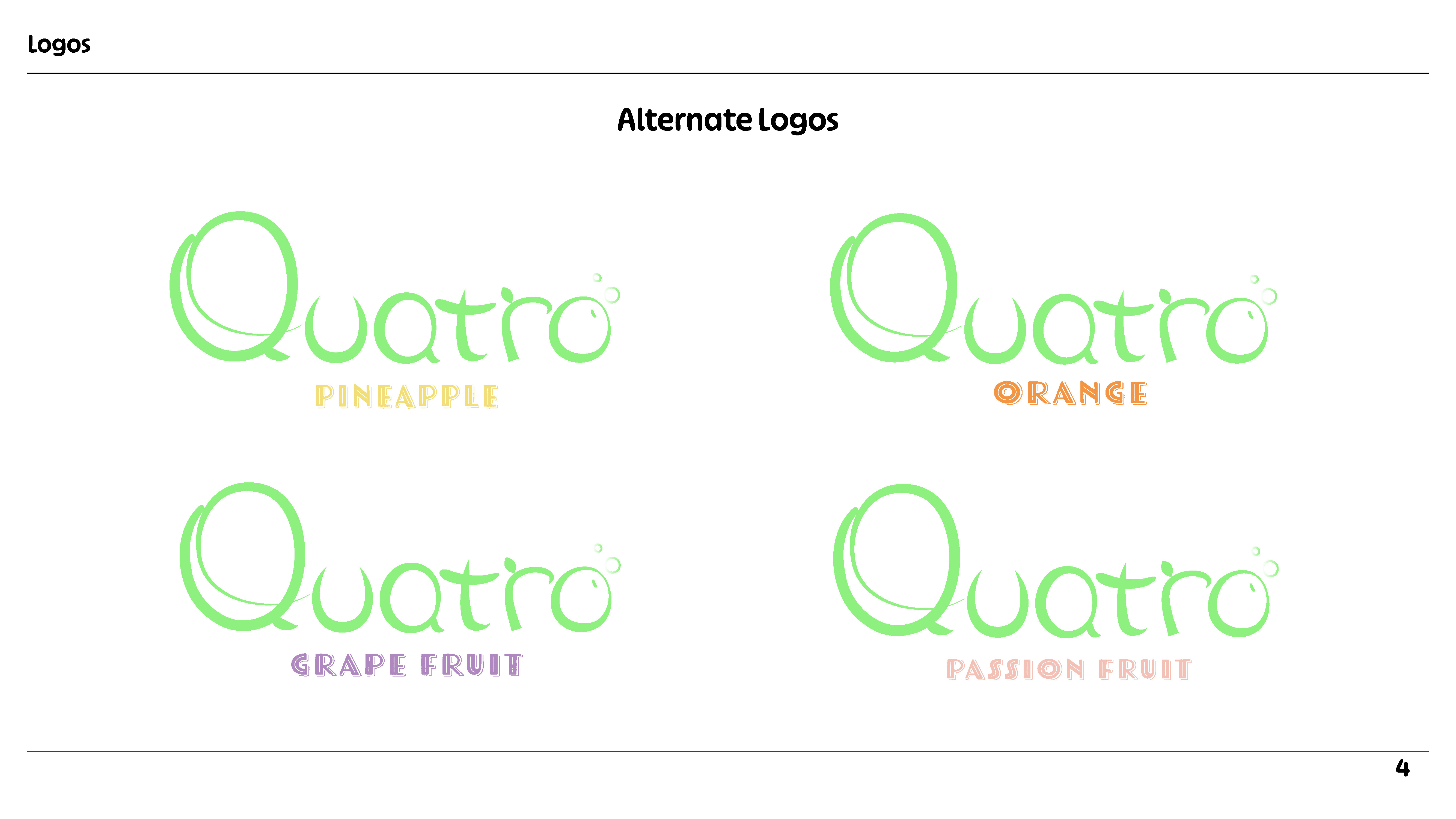
Logo System
The logo revitalises the original 1980s hand-drawn style with cleaner, more functional geometry — keeping its playful spirit while improving legibility and adaptability.
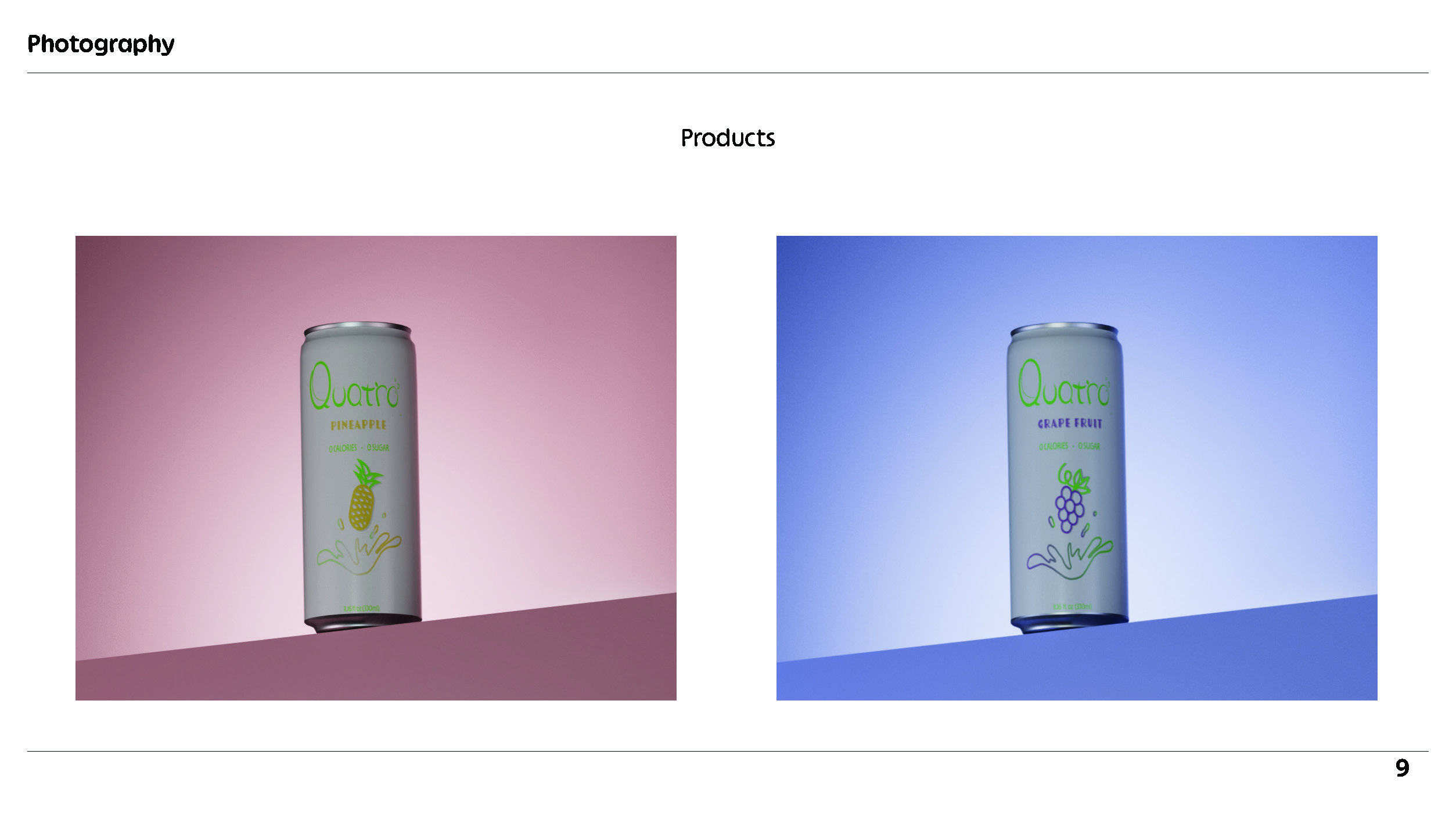
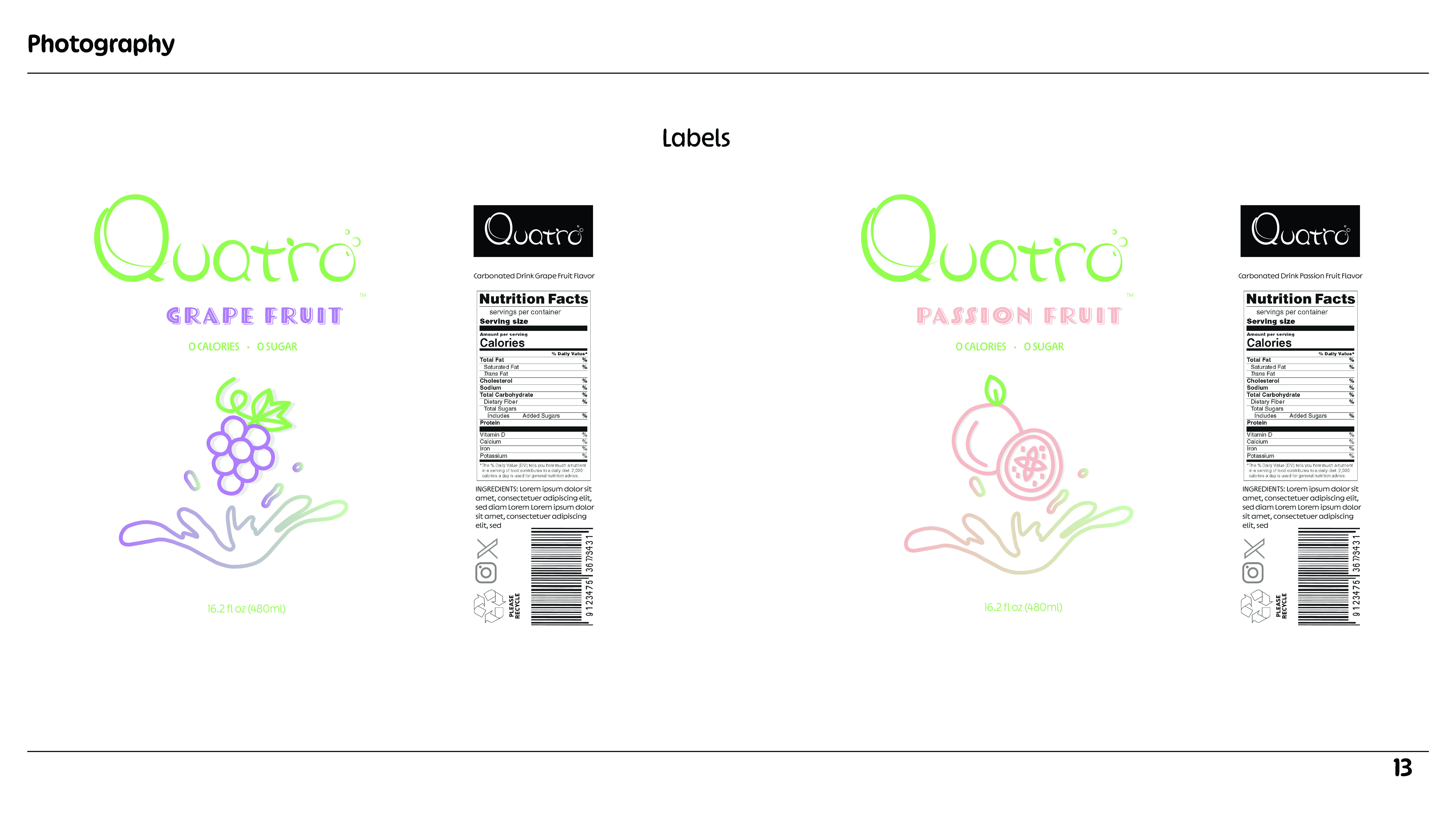
Packaging
The can design places the logo and flavour identity front and centre — bold, uncluttered, and instantly legible.
Earbuds
Overview
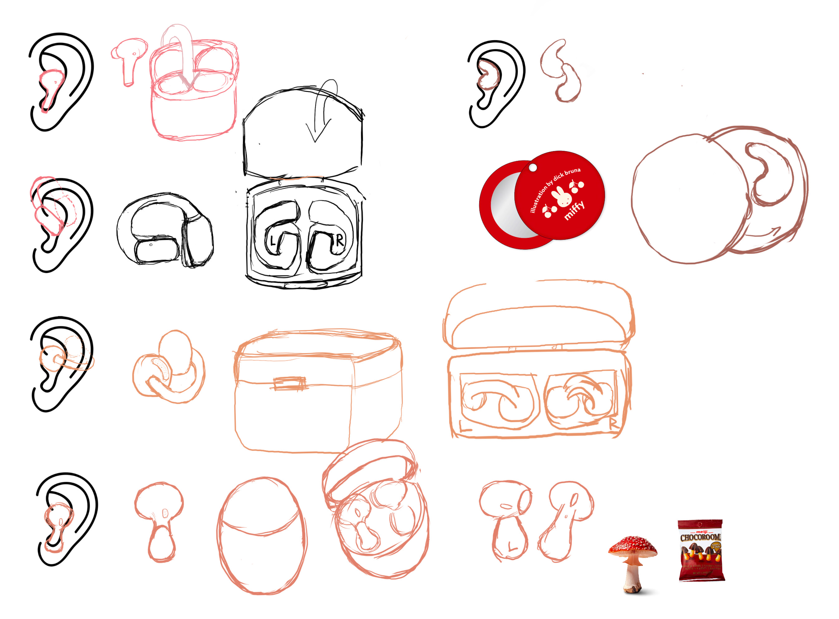
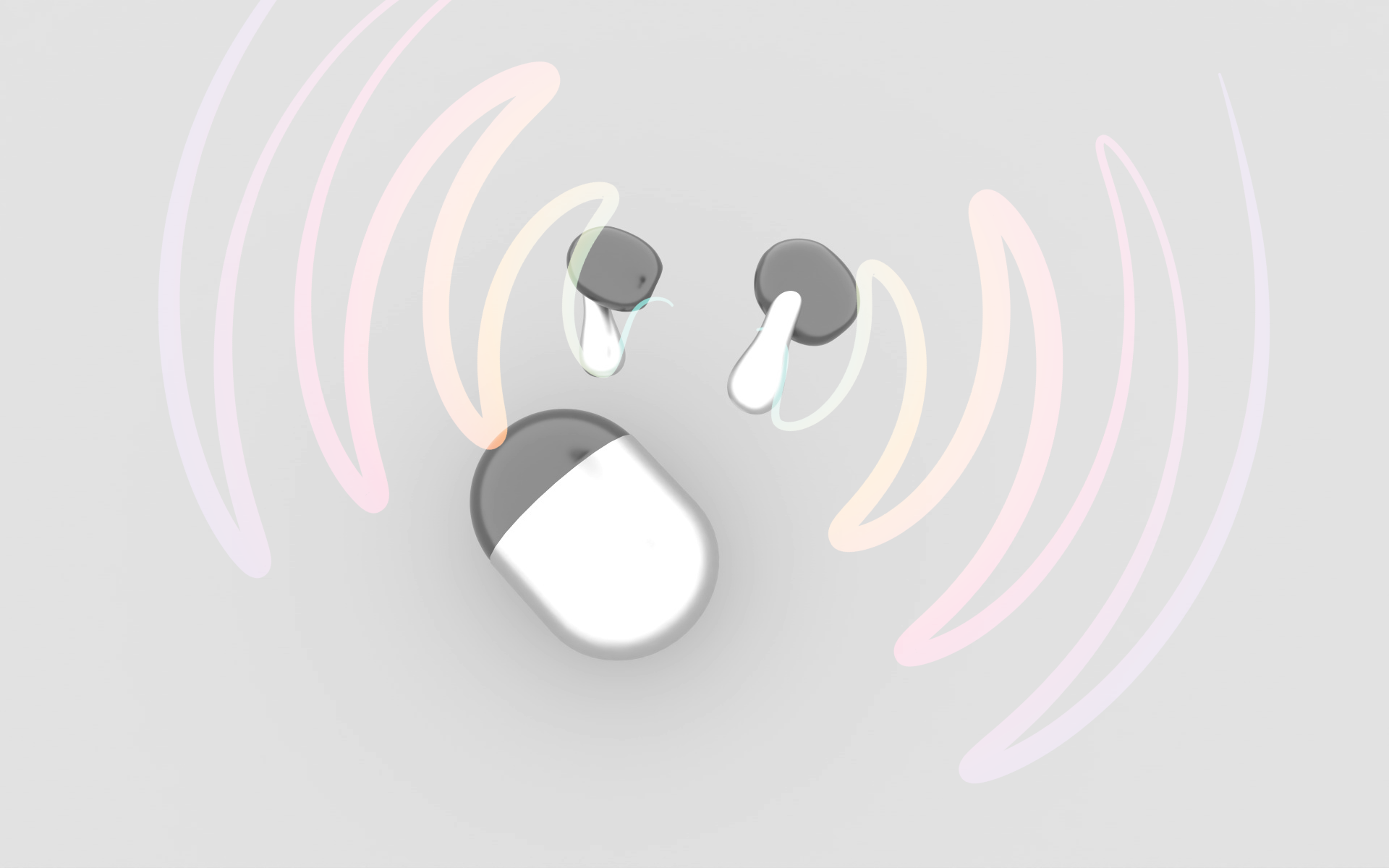
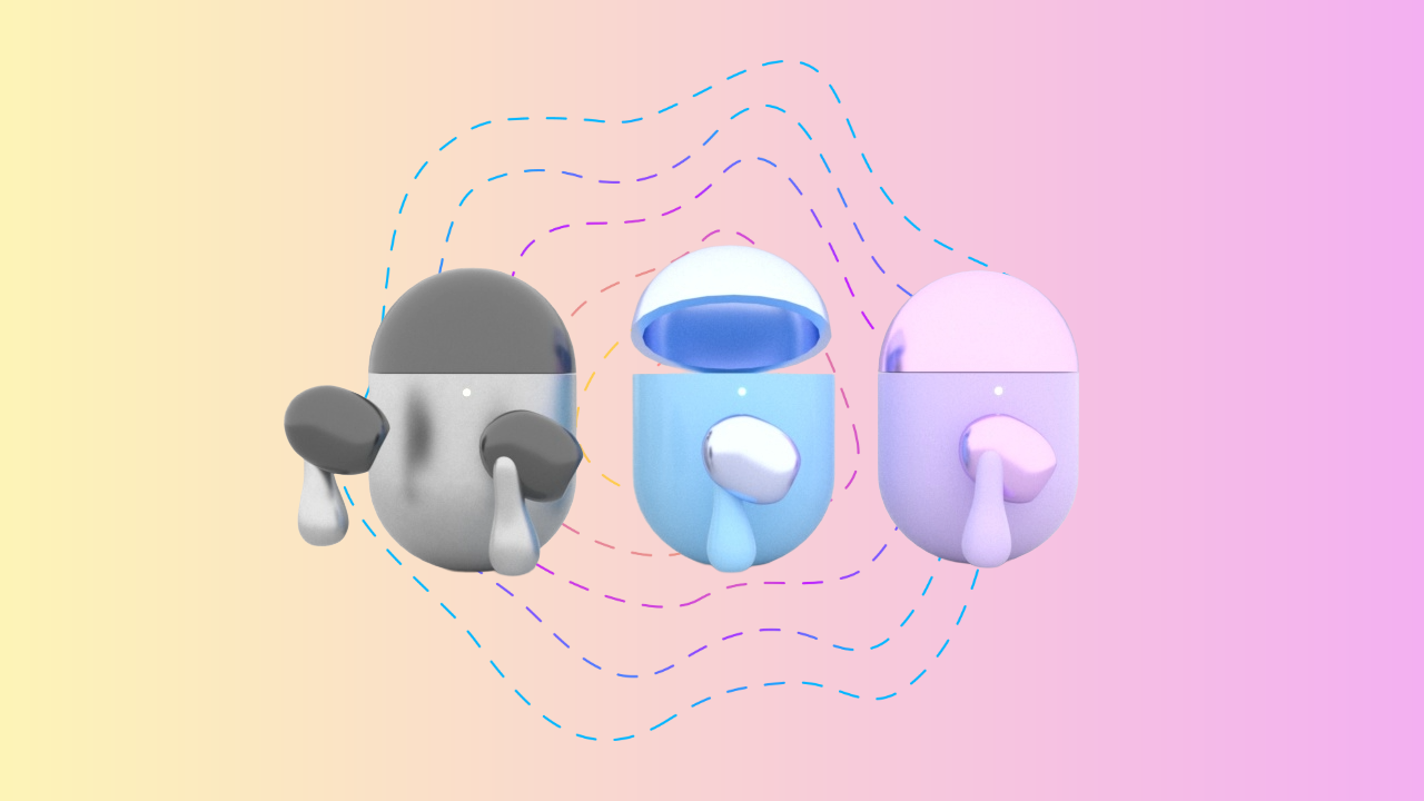
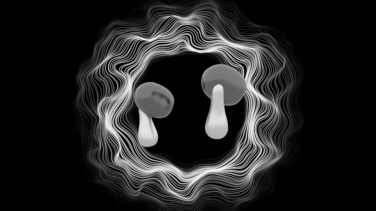
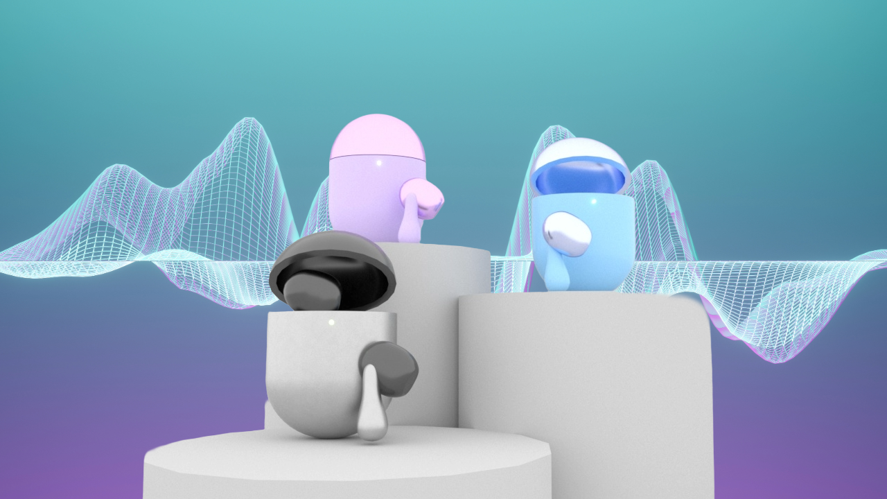
A conceptual wireless earbud design inspired by mushroom forms — blending organic comfort with modern tech. Final 3D model built and rendered in Cinema 4D.
My Role
Product Designer 3D Modeling & Rendering (Cinema 4D)
Completed
2025
Design Process
The design process began with ergonomic sketches focused on fit and comfort—studying the structure of the human ear to ensure the earbud stem and cap would naturally conform. Early designs explored various abstract looks before settling on the mushroom shape.
Visual Language
The promotional visuals emphasize serenity and sound.
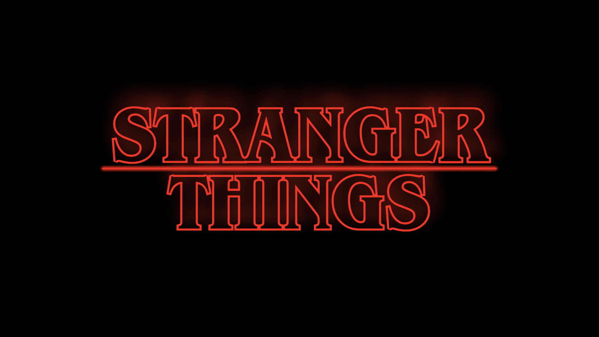
Stranger Things — Title Intro Sequence
Overview
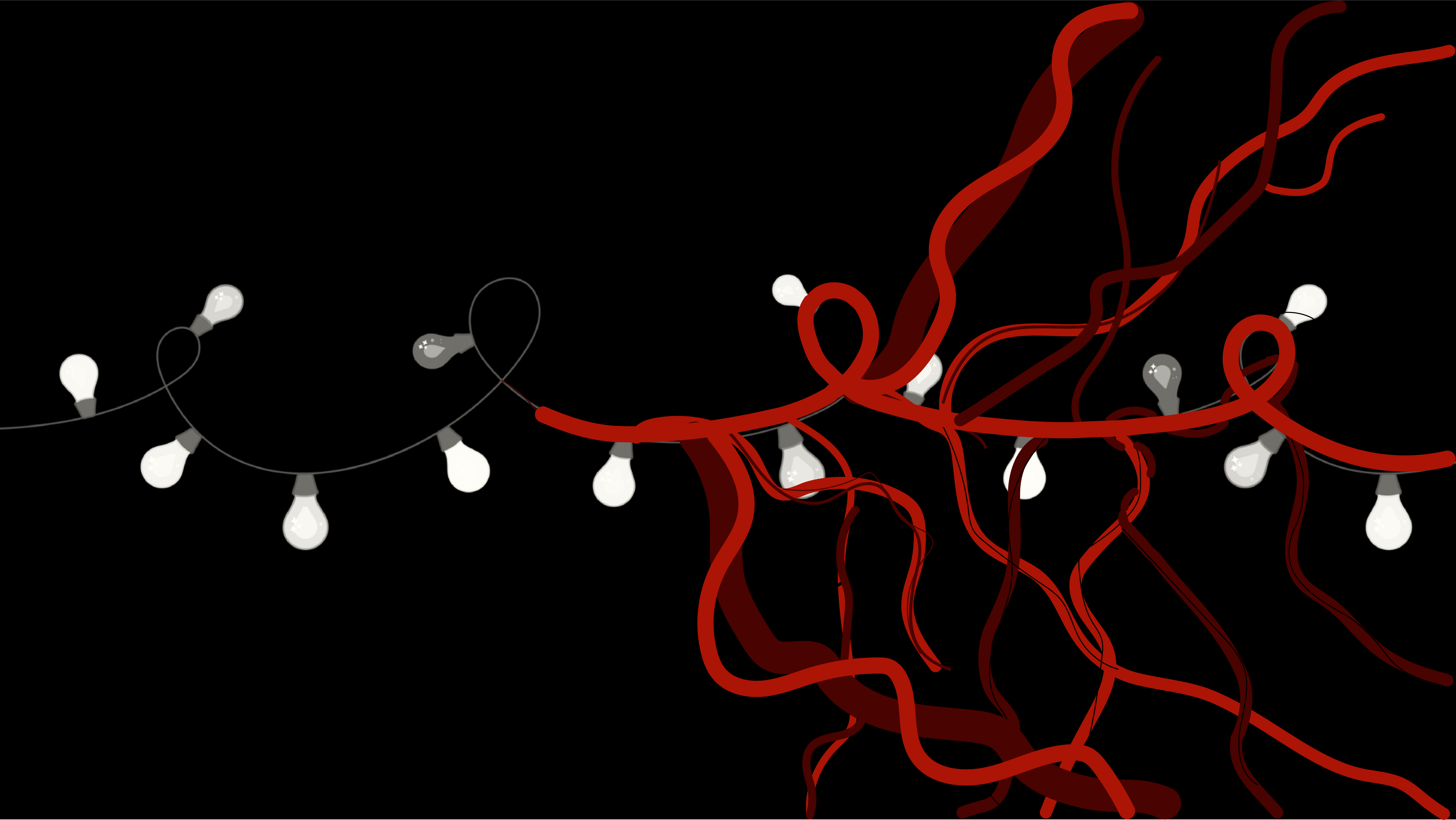
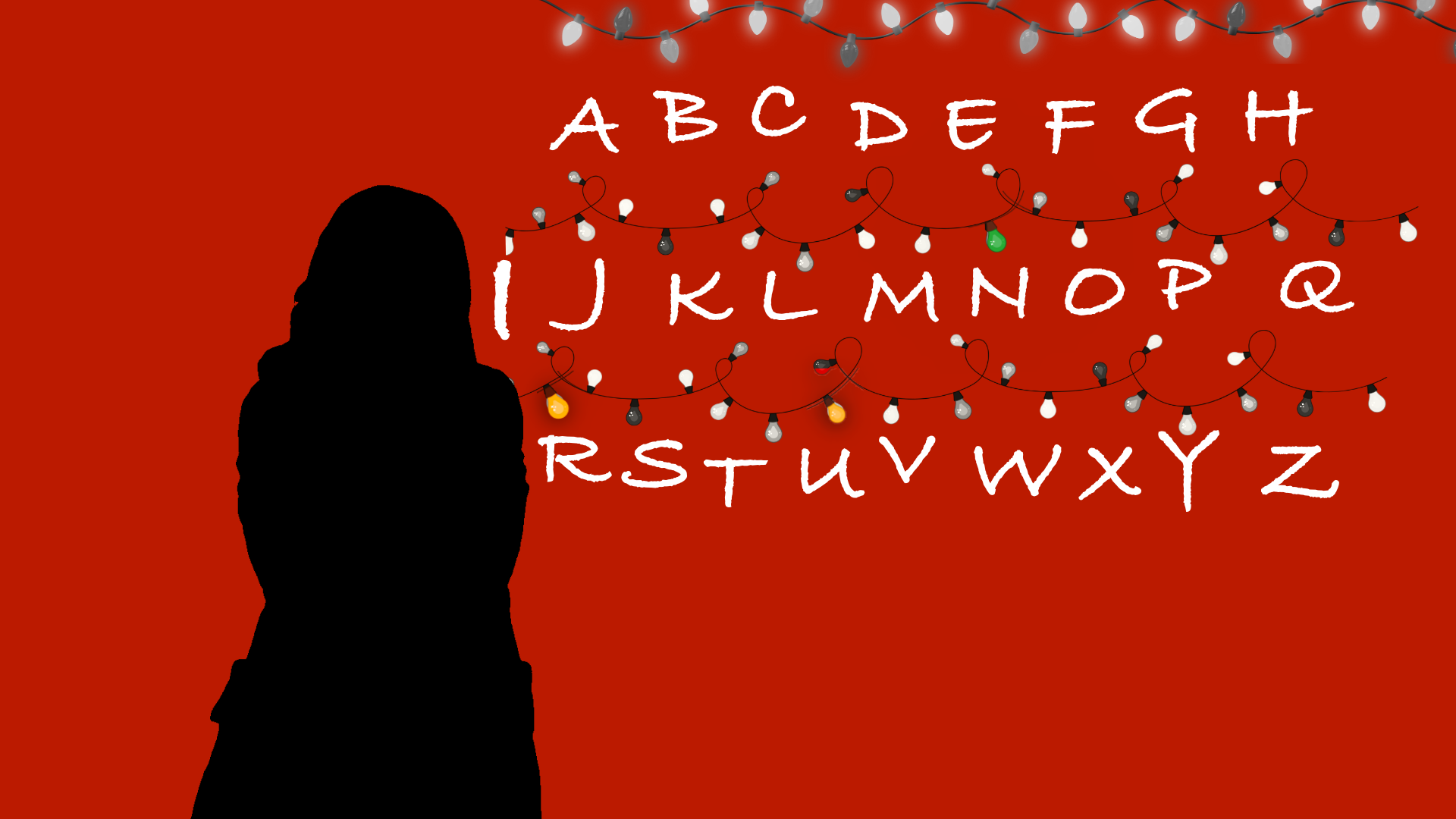
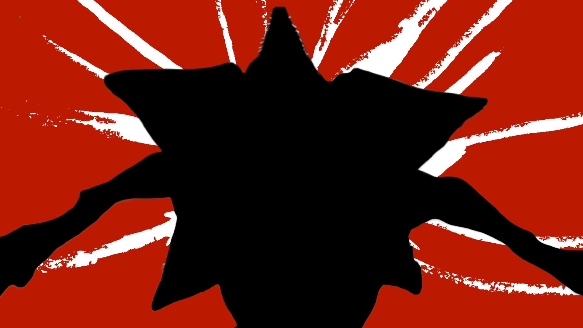
A 40-second motion design sequence recreating the Stranger Things Season 1 opening titles, interpreted through the visual language of the Magpie Murders title sequence. The design draws on Saul Bass-inspired principles: flat silhouettes, a restricted palette of black and deep red, and bold graphic composition.
Created entirely in Adobe After Effects, with a soundtrack by Kyle Dixon and Michael Stein.
My Role
Motion Designer Adobe After Effects
Completed
2026
Visual Direction
The sequence uses a strict two-colour palette — black and deep red — with flat silhouette-based illustration throughout. This constraint was intentional: limiting colour forces the composition and motion to carry the narrative weight, echoing the minimalist approach of classic Saul Bass title sequences.
Key Scenes
The sequence moves through several iconic Stranger Things moments — the alphabet wall with Christmas lights, the Demogorgon reveal, the children on bikes, and the final title card — each treated as a graphic composition rather than a literal recreation.
Motion & Technique
Key After Effects techniques used include Trim Paths for the vine and wire growth animations, Glow Intensity keyframes for the flickering Christmas lights, and Screen blending mode for the alphabet wall illumination effect.
Final Sequence
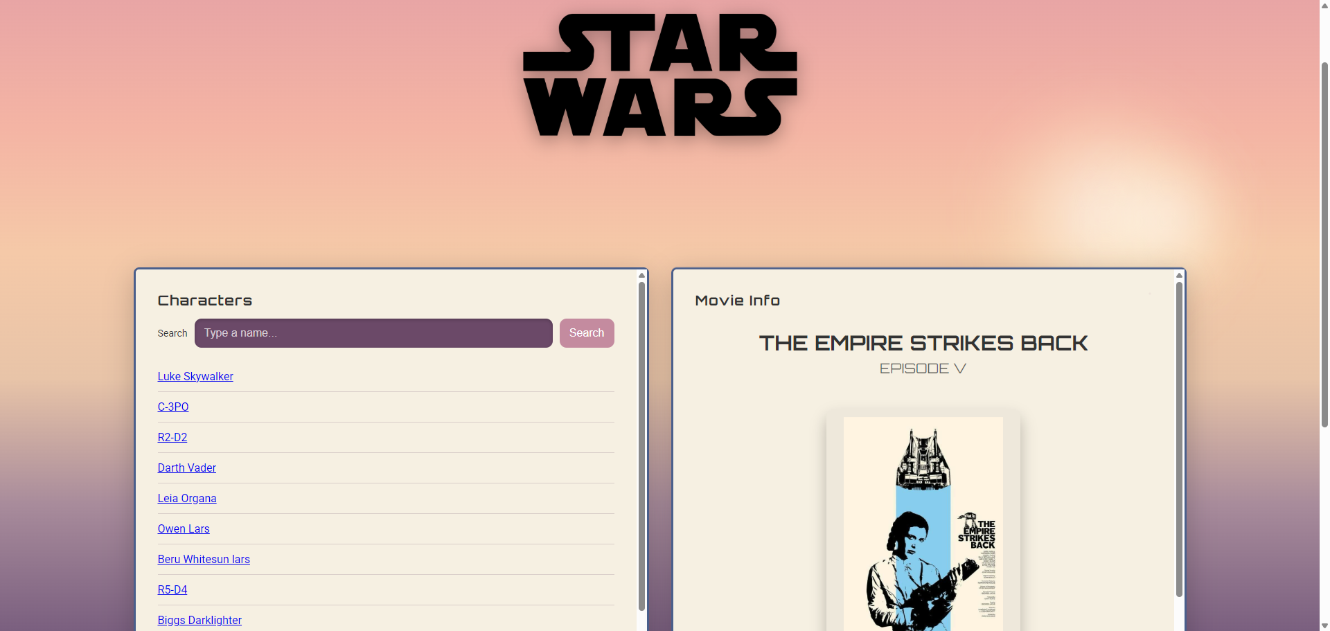
Star Wars Character Guide
Overview
A responsive character and movie guide built with the Star Wars API (SWAPI). Users can browse characters, search by name, and click through to view detailed movie information including the opening crawl and movie poster.
Built as a paired assignment with Justine Ng.
My Role
Frontend Developer JavaScript, Fetch API, SASS
Completed
2026
Technical Approach
The app uses two separate fetch() calls — one to load the character list on page load, and a second triggered when a character is clicked to retrieve their film data. The HTML Template element is used to render movie info dynamically. Loading indicators and error handling are implemented for each stage of the AJAX request.
Features
Character list loaded from SWAPI, live search filtering, click-to-load movie details, responsive layout from mobile to desktop, and GSAP animations.
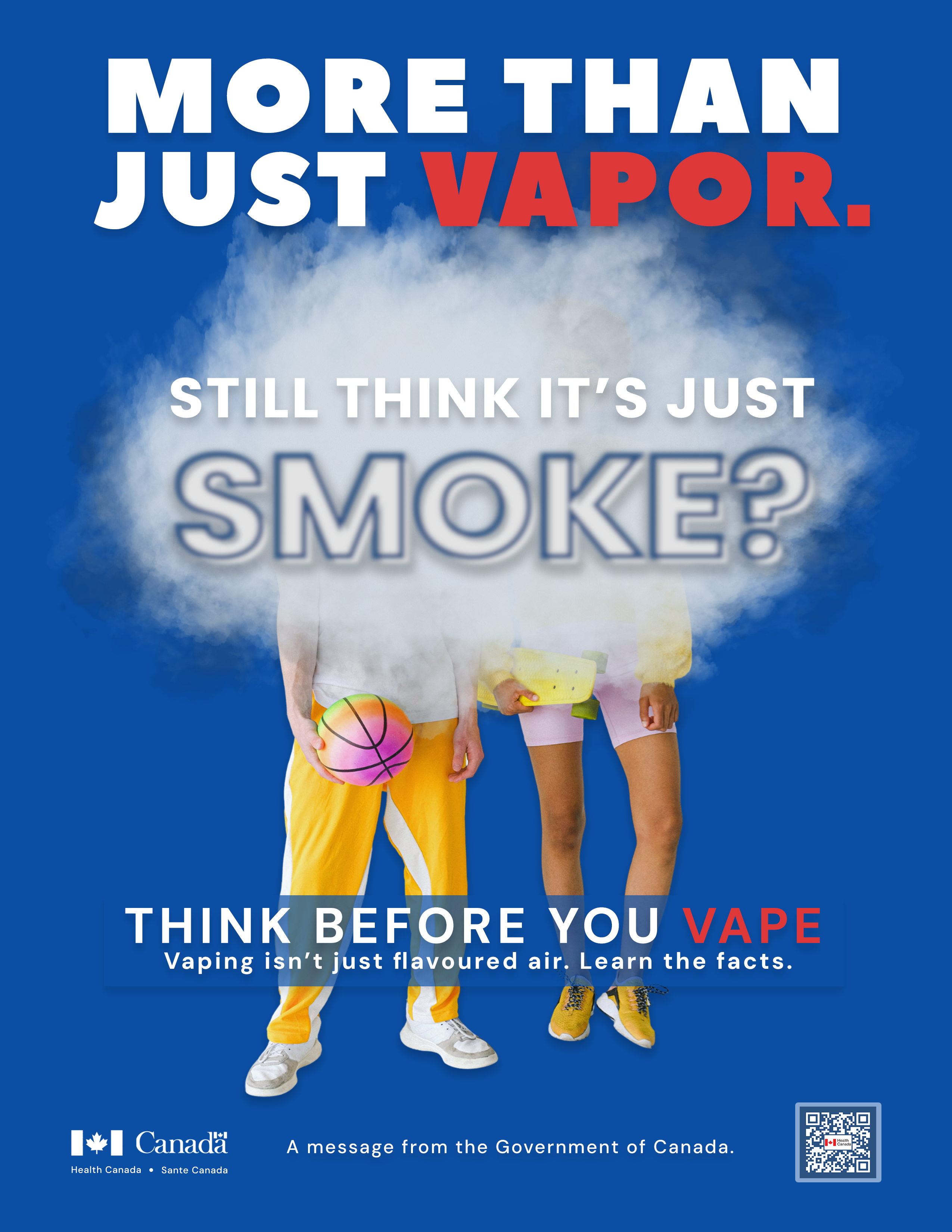
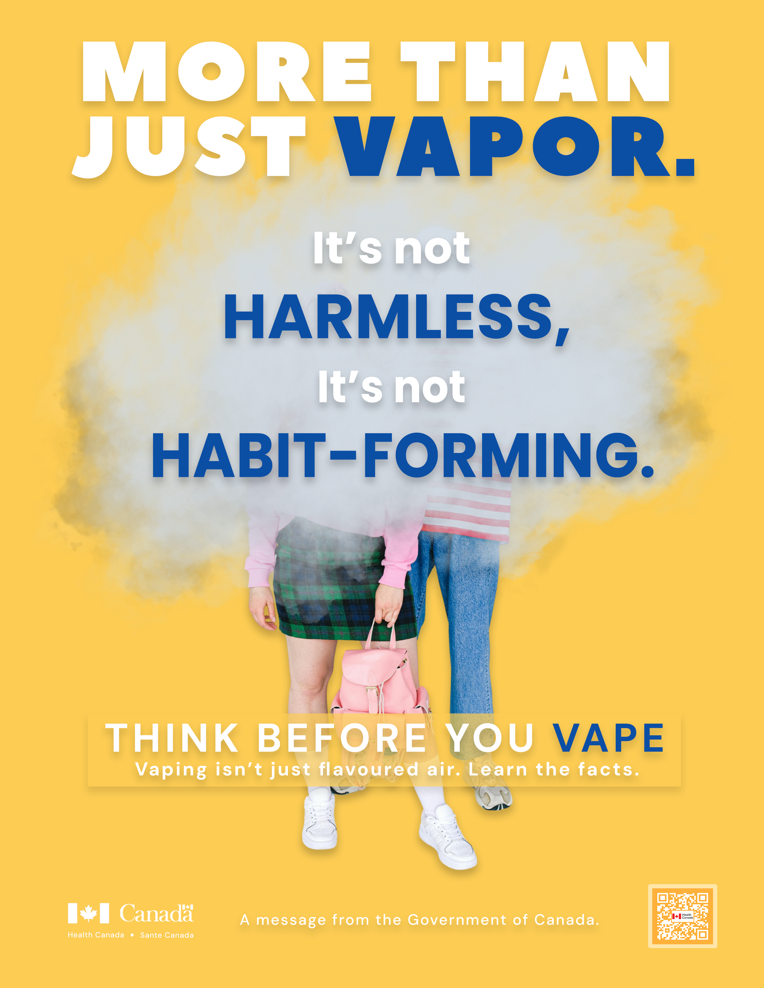
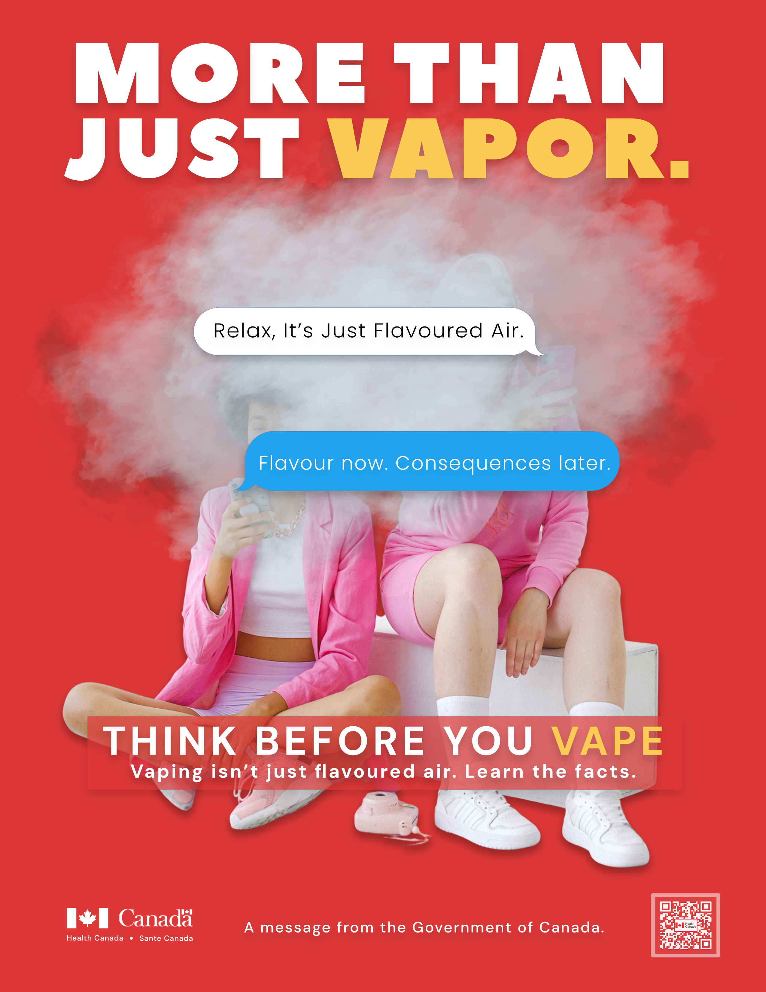
A mini advertising awareness campaign developed for Health Canada, targeting teenagers aged 13–18. The campaign challenges the common misconception that vaping is harmless, reframing it through bold, direct print advertising under the tagline "More Than Just Vapor."
Created in collaboration with Jo Muncaster and Justine Ng.
The core insight: teens don't want to be controlled, but nicotine controls them. Rather than using fear-based messaging, the campaign respects teenage autonomy while presenting clear, impactful truths. Each poster rotates a different sub-tagline to reinforce the campaign message across multiple executions.
Print Advertisements
Three poster executions were designed, each with a distinct colour palette and sub-message while maintaining a consistent visual identity. Bold typography, high contrast imagery, and cloud-of-smoke compositions were used to stop the scroll and provoke thought.